
An emergency service landing page should make the phone call the clear next step. Put the urgent service, service area, current availability, and tap-to-call number near the top. Then give visitors a few solid reasons to trust you, a short backup form, and a fast mobile page that matches the ad or search they used.
People searching during a leak, outage, broken lock, or damaged roof are trying to solve a problem fast. They aren’t looking for a long company story. Your page needs to answer their practical questions before they leave or call another business.
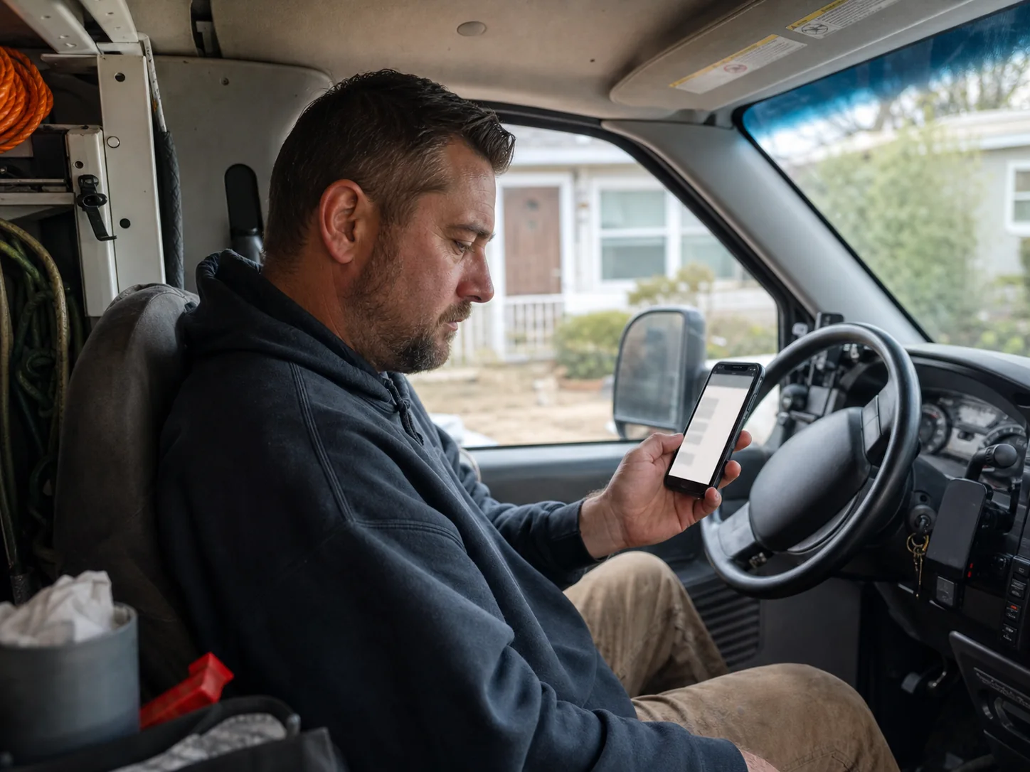
Make the emergency service landing page answer the urgent search
Your headline should closely match the service people searched for. A person who searched for emergency plumbing needs to know that the page is about emergency plumbing. A broad headline such as “We Can Help” makes them work too hard to find that answer.
Use a short headline, then a plain sentence that says what you handle and where. Only state hours you can verify. If your team takes calls after normal business hours, say when. If you offer service only during business hours, say that clearly instead of using “emergency” in a way that may confuse people.
- Put the main service in the headline
- Name the city, region, or towns you actually cover
- State available hours only when they are confirmed
- Place a large tap-to-call button near the headline on phones
- Use the same service wording in the ad, page title, and headline when possible
Google Ads Help explains landing page experience as useful and relevant information, easy navigation, a reasonable number of links, and a page that meets the expectation set by the ad. That fits urgent service pages well. Keep the visitor focused on getting help rather than sending them through a menu full of unrelated choices.
Put a working phone path before everything else
Calling is often the easiest next step for a person with an urgent problem. Show the phone number in the top section, make it tap-to-call on mobile, and repeat it in a visible spot after longer page sections. Use the same number across the page so visitors don’t wonder which one reaches dispatch.
Don’t force people to fill out a form before they can call. A short form is useful as a backup for someone who can’t talk, is at work, or wants a return call. Keep it brief. Ask for a name, phone number, service address or ZIP code, and a short description of the problem. Mark required fields clearly.
Set the right expectation before the call
A clear call button can say “Call for emergency help” or “Call now.” Avoid claims about arrival times unless you have a process that supports them. If calls route to a live person only during set hours, list those hours. If a caller may reach voicemail, say what happens next only if you can keep that promise.
Businesses running paid search should also check their ad call setup. Google Ads Help says call assets can use call reporting and conversion counting, and it advises scheduling them during the times your business can answer. A missed paid call can waste the click that brought the visitor there.
Show service area and availability without overpromising
People need to know whether you can come to their address. Put your core service area close to the top of the page. A simple line can name Houston and nearby communities you truly serve. If travel limits change by job type, explain that in plain language or invite the caller to confirm coverage.
Availability needs the same care. “24/7” is a strong claim. Use it only when a customer can reach your business and receive the stated service at any time. A page can still be useful without it. “Call during our listed hours to check the next available appointment” is clearer than a promise you can’t verify.
Houston business owners may want a seasonal page plan. The Houston Office of Emergency Management notes that tropical storms and hurricanes are a significant Texas Gulf Coast threat. Before storm season, review emergency pages for current phone routing, covered areas, and services you can provide. Remove any storm-related wording that no longer fits your capacity.
Give worried visitors proof they can check
Urgent customers still want to know who they are calling. Put trust details near the call action, not buried at the bottom. Use only proof you can document and keep current.
- Your legal business name and a local business address when you have one
- License details when your trade requires a license and the information is current
- Proof of insurance when you can provide it
- Real customer reviews with their source and permission where needed
- Clear photos of your team, vehicles, or completed work that you have the right to use
- A short explanation of what happens after someone calls
The Federal Trade Commission advises consumers to check licenses, ask for proof of insurance, and read reviews carefully when hiring for home improvement work. Your landing page shouldn’t make claims it can’t support. It should make legitimate information easy to find and verify.
Use reviews with enough context
A star graphic by itself gives little detail. If you use reviews, show the platform, the reviewer name or initials if permitted, and the service mentioned. Don’t edit a review so much that its meaning changes. Link to the profile only when it helps the visitor check the source and doesn’t pull attention away from the call action too early.
Help visitors decide whether to call now
A short list of common urgent problems can help a visitor recognize their situation. Keep the list tied to your real service. A plumber might list burst pipes, active leaks, and overflowing fixtures. An electrician might list loss of power in part of a home or a burning smell from an outlet. Don’t list a repair that your team doesn’t handle.
Some situations need public emergency help first. Add a clear safety note where it fits your trade. For fire, smoke, a trapped person, a suspected gas leak, or immediate danger, tell people to call 911 first. Do not let a marketing page make a private service call look like the right choice for a life safety emergency.
After the problem list, explain the next few steps. Keep it honest and simple.
- Call and describe the problem and location.
- Confirm whether the address is in the service area.
- Share the available next step based on current scheduling.
- Give the customer any preparation instructions that apply.
This section reduces uncertainty. It also keeps your page from implying a fixed response time when travel, weather, staffing, and the job itself may change what is possible.

Make the page easy to use on a phone
An urgent search often happens on a phone. Test the page with your own device. Can you see the service name, area, and call button without hunting? Does the number open the phone app? Can you read the text without zooming? Does the form work with a thumb?
Speed matters too. A 2017 Think with Google and SOASTA study found that bounce probability rose 113 percent when mobile load time increased from one second to seven seconds. That study isn’t an emergency-service benchmark, yet it is a useful reminder to keep pages light. Compress large images, remove videos that delay the first screen, limit outside tracking scripts, and test after each major change.

Keep page choices limited
A standard site menu can be useful, though it may distract an urgent visitor. On a dedicated emergency page, keep the main choices close to the task. Call, request a callback, check service area, and learn about the problem are usually enough. If you include links to other services, place them lower on the page after the main contact path.
Track calls and fix the weak point
Publishing the page is only the start. Track calls from the page, form submissions, tap-to-call button use, and paid ad calls when you run ads. Review call recordings only with the right notice and setup for your area. Look for practical gaps such as calls that arrive outside answer hours, a form field that stops submissions, or visitors asking whether you cover their ZIP code.
Test a single change at a time when possible. You might make the service area clearer, move the call button higher, or replace a vague headline. Watch whether the change improves qualified calls rather than only raising button clicks. A page that produces calls you can’t serve needs a clearer message, not a louder one.
Questions business owners ask about urgent service pages
Should every emergency service have its own landing page?
Separate pages can make sense when each service has different customer needs, service areas, proof, or safety steps. A single page may work when the services and call process are very similar. Don’t create thin pages that only swap a service name. Each page needs useful details that match the search.
What should an emergency service form ask for?
Ask only for details needed to return the call or check coverage. Name, phone number, address or ZIP code, and a brief problem description are often enough. Avoid long questionnaires. A person dealing with damage may abandon a form that asks for too much.
Can an emergency page use before and after photos?
Yes, if the photos are real, you have permission to use them, and they show relevant work. Label them plainly. Don’t use stock damage photos in a way that makes visitors think they show your job. Images should support the decision to call, not create fear.
If you need a clearer emergency service landing page for a local service business, contact ASAP Marketing Solution for web design and development help at (832) 737-2752. The team works with local service providers and can help you build a page around the calls you want to receive.